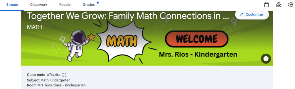
Together We Grow: Family Math Connections
Angela M. Rios Zuluaga
1. Introduction
Usability testing is a critical part of the instructional design process because it allows real users to interact with the course before implementation. For my course Together We Grow: Family Math Connections, I invited two colleagues, one administrator, and two kindergarten parents to test the “Start Here / Introduction” section and the first activity of Module 1. Their feedback provided meaningful insight into issues of navigation, clarity, visual design, and overall user experience.
All participants completed a structured Google Form and also provided open-ended feedback through written comments. This usability test helped me identify improvements that made the course clearer, more intuitive, and more supportive for families.
2. Email Invitation to Participants
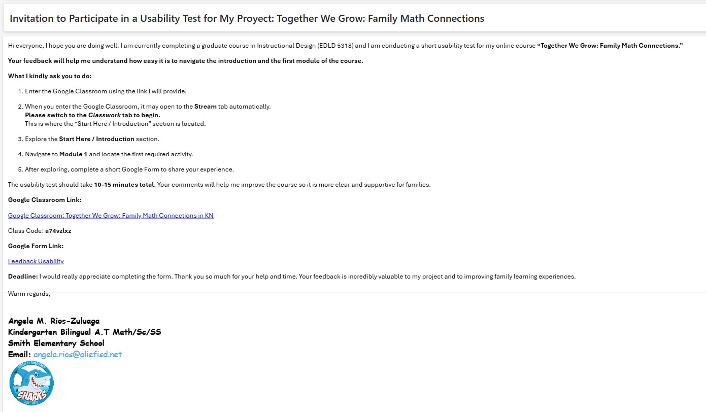
English version below:
Subject: Request for Usability Testing Support – Kindergarten Math Course
Good afternoon,
I hope you are doing well. I am currently completing an instructional design project for my graduate program and would greatly appreciate your help. I am testing the usability of a Google Classroom course created for kindergarten families. Your participation includes navigating the “Start Here” section, completing one activity from Module 1, and filling out a short feedback form. This process will take approximately 10–15 minutes.
Your feedback will help me identify areas of improvement and ensure the course is clear and accessible for families.
Thank you so much for your support!
Warm regards,
Angela Rios
3. Participant Profile – Feedback
Of the five participants:
- 2 were teachers
- 1 was an administrator
- 2 were kindergarten parents
Three participants had previously used Google Classroom, while two had limited or no experience. This range of familiarity provided valuable insight into how different user groups navigate digital learning environments
4. Summary of Usability Findings
To better understand the overall feedback, I synthesized the responses into categories and documented how many participants experienced each issue. The following table summarizes the most common usability findings based on their input.
5. What Worked Well
The usability testing revealed several strengths in the course design that positively supported user navigation and understanding:
✔ Clear visual icons guided navigation once users were in the correct tab.
Participants consistently shared that once they moved into the Classwork tab, the visual icon system made the structure intuitive. Icons such as checkmarks, arrows, and subject-specific symbols provided visual cues that reduced cognitive load and helped both teachers and parents understand where to click next. This reinforced that visual scaffolding was effective for diverse users, especially those unfamiliar with online platforms.
✔ Instructions inside each activity were described as “simple and easy to follow.”
Testers appreciated the clear, concise instructions embedded in each task. Steps were broken down into manageable pieces, and the presence of short explanations prevented overwhelm. This clarity demonstrates alignment with Mayer’s multimedia principle of coherence, ensuring only essential information is presented.
✔ Parents appreciated the bilingual videos and visual supports.
Parent participants highlighted that the bilingual components particularly the Welcome Video helped them feel included and supported. The combination of English and Spanish ensured accessibility and reduced potential misunderstandings. Visual supports (such as screenshots, arrows, and sample artifacts) also enhanced comprehension for users not familiar with educational terminology.
✔ The structure of the module felt predictable and consistent.
Users stated that once they completed the first section, they understood the pattern of how information was presented. This sense of predictability minimized anxiety, improved confidence, and allowed them to focus on understanding the content rather than deciphering the layout. A consistent structure supports learner autonomy, one of the core elements of the COVA approach.
6. What Did Not Work Well
Despite the strengths of the design, the usability testing revealed several areas that needed refinement:
✘ Navigation confusion at the beginning (Stream vs. Classwork).
The most significant issue occurred before the user even began engaging with the course. Because Google Classroom automatically opens on the Stream page, users spent up to 2–3 minutes trying to locate the “Start Here” section. Several testers assumed the content was missing or not yet published. This initial barrier reduced confidence and created unnecessary frustration.
✘ Repetition of content created unnecessary scrolling.
Participants noticed repeated elements such as the i-Ready informational PDF and the bilingual welcome video appearing in multiple locations. This redundancy led users to believe new information would be provided, only to discover it was the same content. Repetition increased scrolling and slowed progress, interrupting the flow of learning.
✘ Some text headers did not match the content beneath them.
A mislabeled subheader “Module 1: numbers 0–5” appeared within the Access Guide, which caused testers to assume they had entered the first module. This mismatch between heading and actual content created momentary confusion. Although not as severe as the navigation issue, it affected the user’s sense of orientation and accuracy in the course.
✘ Minor confusion in i-Ready instructions.
The phrase “work no more than 15 minutes a day” led to differing interpretations. Some parents questioned whether extremely short work periods (0–5 minutes) would meet expectations. Many suggested that “at least 15 minutes” provides clearer guidance. This highlighted the importance of precise, parent-friendly language in digital courses for families.
7. Suggestions for Improvement
Participants recommended:
- Directing users to Classwork instead of Stream
- Eliminating duplicate files and redundant resources
- Enlarging QR codes for improved scanning
- Correcting and standardizing subheaders
- Clarifying instructional language for families
- Adding visual cues to guide navigation more easily
These suggestions directly informed the revisions implemented in the course.
8. Learning Support & Infrastructure Needs
Based on feedback, families will require:
- Clear, bilingual navigation guidance
- Predictable visual layout
- Mobile-friendly formatting
- Visual cues and labels that reduce cognitive load
- Explicit time expectations for digital learning activities
These considerations align with Mayer’s Multimedia Learning Principles and the COVA model, reinforcing the need for clarity, autonomy, and authentic support.
9. Revisions Made Based on Feedback
🟣 Navigation
- Added a Stream message redirecting users to Classwork
- Positioned the Welcome Video only in the Start Here section
🟣 Content Refinement
- Removed redundant PDFs and repeated videos
- Corrected misaligned headings
🟣 Visual Enhancements
- Enlarged the QR code in the syllabus
- Adjusted layout spacing for readability
🟣 Instruction Clarity
- Updated i-Ready instructions to:
“Students should complete at least 15 minutes per day.” and added more visual icons in parent’s letter instructions.
10. Usability Video
This video summarizes who participated, key findings, changes made, and how the testing improved alignment between outcomes, activities, assessment, and learner support.
11. Final Reflection
This usability testing process helped me see my course through the eyes of real users. I realized that even small design choices such as file placement, headings, and duplicated materials can significantly affect a user’s experience. I learned the importance of simplifying navigation, reducing cognitive load, and ensuring that families who are unfamiliar with Google Classroom can participate confidently.
This experience strengthened my skills as a reflective instructional designer and helped me better understand how to build meaningful, accessible digital learning environments for families.
I am sincerely grateful to Dr. Bellard for guiding us through this process and helping us grow as thoughtful, intentional designers.
References
American Psychological Association. (2020). Publication manual of the American Psychological Association (7th ed.).
Bellard, Q. (2024). Instructional Design for Online Learning – Usability Testing Module. Lamar University.
Harapnuik, D. (2020). Assessment of, for, and as learning [Video]. Lamar University.
Mayer, R. E. (2014). The Cambridge handbook of multimedia learning. Cambridge University Press.
Appendix: Full Academic Reflection
(Optional for readers who want a deeper look at the research-based analysis behind the usability testing.)